
Challenge 09 - Zones, sectors, and shapes
2014-05-24 00:00:00This post is part of a series on how to do permaculture design with free software and tools. The other parts of the series can be found here: Installing software, getting background imagery, contours part one, contours part two (google maps), contours part three (DIY surveying), making mosaics, drawing swales, trees, and roads, research tools for permaculture
Alright, we're at the point now where you have most of what you need to do a nice looking design with inkscape and other open source tools and data. I just have a few more things I want to add to the mix, so that you can have some nice additional features. We'll cover drawing zones, sectors, spirals, general shapes, and we'll cover a bit about colors, textures, and transparency. Then I think you'll have everything you need to get rolling! Let's get started.
Drawing Zones and Sectors
Zone and sector analysis is one of the simplest and most useful parts of a good permaculture design - it lets us keep our design focused on the actual use of the land, and keeps us from neglecting important outside influences. Here's how I draw zones and sectors in inkscape.
Zones - freeform shapes with some transparency goodness
Zones usually work out to be a set of roughly concentric shapes centered around the living area. The easiest way to represent that is to draw the zones with a simple bezier curve and then fill it with a color that's somewhat transparent so you can see what's under it in the drawing.
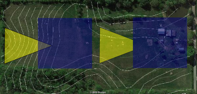
There are two ways to use transparency with inkscape, and they have subtly different results. The first way is to set the fill of the object to transparent. This lets you see any objects beneath it, even if they're on the same layer. The second way is to set the whole layer to be transparent, which then has the interesting effect of masking out parts of objects that are hidden within the layer, but still allowing you to see what's on layers below. Here's a picture to illustrate what I'm describing. Both sides have exactly the same objects in them, but the left side uses object transparency, and the right side uses layer transparency. Note how the point of the triangle on the right is hidden, but you can still see what's on the layer below clearly. We'll use this effect to make our zones look good:
- Make a new layer called zones (ctrl + shift + L, then click the '+')
- Move the new layer so that it's just above the contours in the stack. You can move a layer up and down by clicking the up and down caret marks in the layes dialog with the layer selected.
- Set the layer's transparency to something around 50% (use the Opacity % slider in the layers dialog)
- Pick the pen tool (shift + F6 or
 )
) - Draw the border for zone 5, or if there isn't a zone 5 start with the broadest area zone you have. This border can enclose the entire property, including other zones - we'll be drawing the smaller zones over the top so it's usually easiest to just draw the whole zone as a solid chunk. The reason we go in backward order is to make sure your zones are stacked right (the smallest is on top). If you draw them in a different order, you can move them up and down afterward using page up and page down.
- Pick a fill color for the zone, either using the fill and stroke dialog (ctrl + shift + F) or using the color tiles on the bottom of the window.
- Repeat steps 5 and 6 for each remaining zone.
- Now you can adjust the layer transparency so that it looks like you want it to (I usually leave it pretty faint, just a subtle change - the picture below is more intense than I like, but it makes it easier to see for the tutorial).
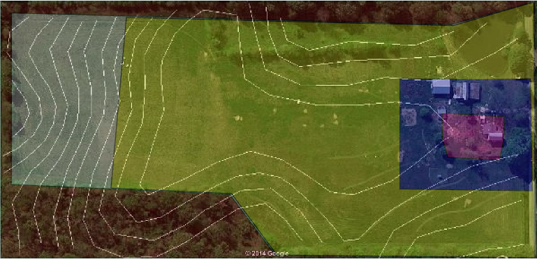
Here's what you should end up with if you follow that process - purple is zone 1, blue is 2, yellow is 3, white is 4, and red is 5.
Sectors - circles with a missing wedge
I draw sectors as basically circles with a wedge cut out. Inkscape has a very handy tool for this - the circle tool. When you draw a circle or an ellipse, it has a little circular grip on it that you can use to cut the circle in a couple of ways after the fact. Play around with this to get a feel for what it does, but in a nutshell it will either cut a wedge out of the circle from the center (like a pie slice) or it will chop off part of the circle straight across (making the circle flat on one side). To make it flat on one side, drag with your mouse inside the circle. To make the pie slice, drag with it outside of the circle. Here's what I mean:

One annoying "feature" of inkscape is that after you alter your circle this way, circles you draw in the future will also have that cut taken out of them. To restore a cut circle back to wholeness, shift+click on the little grip that you used to do the cut in the first place (you have to have the circle tool selected to do this).
You can draw lots of these things on top of each other with the same center to get a nice sector map. Here's what you need to do:
- Create a new layer called sectors and make it current
- Decide where the center of your sector map needs to be
- Pick the circle tool
 and
draw a circle over where you want the sectors to be. To draw a circle centered
where you click, hold ctrl+shift while you click and drag. ctrl keeps it
circular instead of squashing out like an ellipse, and shift tells it that you
want to put the center of the circle where you clicked. You can still draw an
ellipse with ctrl pressed, but it makes it a lot easier to draw a true circle.
Play with it and you'll see what I mean.
and
draw a circle over where you want the sectors to be. To draw a circle centered
where you click, hold ctrl+shift while you click and drag. ctrl keeps it
circular instead of squashing out like an ellipse, and shift tells it that you
want to put the center of the circle where you clicked. You can still draw an
ellipse with ctrl pressed, but it makes it a lot easier to draw a true circle.
Play with it and you'll see what I mean. - Click the little circular handle on the right hand side of the circle, and drag your mouse around outside of the circle to cut a pie slice out of it.
- When the slice is about the right size, release the mouse button and pick the
select tool

- Click the circle once after it's selected to change to rotate mode. After you see the little bent arrows at the corners, look for a small '+' near the center of the object. That is what inkscape will use as the rotation center - you can click and drag it so that it's on the point of the triangle we cut out of the circle (otherwise the circle will move a little when you rotate it). Now grab one of the bent arrows at the corners to spin the circle around until the wedge is where you want it.
- Pick the text tool (F8 or
 )
and click inside the sector to enter your label. The text will probably be
ridiculously gigantic while you type it - don't worry! We'll fix it in the next
step.
)
and click inside the sector to enter your label. The text will probably be
ridiculously gigantic while you type it - don't worry! We'll fix it in the next
step. - Enter your label, then use the select tool again to scale the text down to size(you can hold down ctrl to keep it from getting distorted while you scale it if you need to.)
- When you have it arranged like you want it, use the select tool (F1 or )
to pick both the text and the circle (hold shift while you pick them to get
both), then press ctrl+ g to make them into a group. This lets you move them
up and down the stack together instead of having to do each one separately. You
can still edit the text or change the circle while they're grouped by using the
text or circle tools, respectively. If you want to ungroup them, just pick one
and press ctrl + shift + G
- Repeat from step (3) for each sector. When you want to move a sector to put it below what's already there, or move another one to put it on top, select it and press either page up or page down. It can sometimes be hard to select jsut the thing you want - if that happens, you can hold down the alt key while picking the same spot over and over, and inkscape will cycle through all the stuff under the mouse in order until you get the one you want.
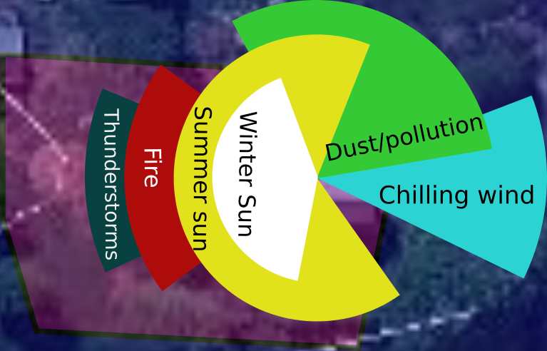
Here's a sector map to show what this should look like when you're done. The map is turned 90 degrees to make it fit better on the page, in case you're wondering how I could have the sun going South-North instead of East-West.. ;):
Some notes on colors, lines, and other things
The fill and stroke dialog lets you do a lot of things with color and transparency, but it's a little tricky when you're getting started. Here are some basic rules of thumb:
- The default color setup uses the "RGB" colorspace. This means that it makes colors by mixing various amounts of Red, Green, and Blue. Unfortunately, it's a real pain in the neck to figure out what color you want by sliding red green and blue sliders around. Fortunately, they also provide the "HSL" colorspace (Hue, Saturation, Lightness). In this version of colors, you pick the actual color with one slider (the hue). You can then control how intense the color is using the saturation slider, and how much white there is in it using the lightness slider. I tend to use this colorspace more than any other, and recommend that you try it to see what you can do. Particularly, play with the saturation slider - that's how you can make the vivid primary colors of the hue slider into something more pleasant.
- You can make all kinds of different lines and arrows with the settings under the "stroke style" tab in the Fill and Stroke dialog. The stroke of any object is the outline of it - a plain line is just stroke, but a filled shape can have a border drawn around it with all of the same dashed, dotted, etc. lines that you can use for your plain lines. Different line styles are helpful when you're trying to put a lot of information in your map about stuff like water lines, leach fields, gas lines, power lines, etc.
- When you have your feet under you with inkscape, you can start doing some more fun stuff with what they call "filters." Filters basically allow you to add texture to your objects so that they're not just flat colors. If you click the Filters item on the menu bar, you'll see dozens of different effects that are available. Play around with these, and remember you can always back up with undo, or ctrl + z. One effect that's particularly useful is the drop shadow - put this effect on some of your trees and plants to give your drawing a hint of 3D feel.
Inkscape's shapes
Inkscape provides a small library of shapes that are sometimes handy - you can draw stars, polyons, and spirals with just a couple of clicks. The spiral tool is a very convenient way to draw an herb spiral...
When you pick the polygon tool ('*' or  ),
make sure you look up at the top of the window as the toolbar will change to
give you some extra controls. You can pick the number of corners, whether it's a
star or a polygon, the roundness to apply, and a few other things. When you've
drawn the basic shape you can also grab the shape's handles and do some funky
stuff with it by dragging them around. It's pretty hard to explain this in
words, so I recommend you just give it a try to see what it does.
),
make sure you look up at the top of the window as the toolbar will change to
give you some extra controls. You can pick the number of corners, whether it's a
star or a polygon, the roundness to apply, and a few other things. When you've
drawn the basic shape you can also grab the shape's handles and do some funky
stuff with it by dragging them around. It's pretty hard to explain this in
words, so I recommend you just give it a try to see what it does.
The spiral tool (F9 or  )
also has settings up at the top of the window. You can set the number of turns
to make, the spacing between turns (called divergence), and the inside radius to
leave open. Also, you can tinker with many of these things using the handles on
the curve.
)
also has settings up at the top of the window. You can set the number of turns
to make, the spacing between turns (called divergence), and the inside radius to
leave open. Also, you can tinker with many of these things using the handles on
the curve.
Exporting your drawing
Okay, the last step in the process of making a drawing to use in your design submission is exporting the image! When you're ready to include images in your design report, there are two ways to do it (actually there are more, but I only ever use two...). You can either export the entire drawing, or you can export just a selection.
To export the whole drawing, make sure nothing is selected and press ctrl + shift + E. If you have stuff selected when you press it, inkscape will default to exporting only the portion of the image that has stuff selected in it (it will get everything under the selection rectangle, including visible parts of other things that are not selected). If you do that by accident, you can click the buttons up at the top of the export window to change it (the button labeled Drawing will export the entire picture).
The export window is a complicated looking window with lots of settings. The only ones you typically need to worry about are the width and the file name. If you're making images to put into a report, you probably don't want a width more than about 800px. If you change the number in the width box to 800, the height will change automatically so that the image keeps the correct ratio of width to height. The file name is just below the width/height boxes - you can either use the button or you can type in the destination where you want the image to go. When you have it all set, just click the Export button and it'll put your image where you want it.
One note - the export window will do its calculations every time you change your selection for as long as it's open. Sometimes this is really slow for a big drawing, so I recommend closing the export window as soon as your export is done if you have a lot of stuff in your drawing. When you're ready to export another shot, just press ctrl + shift + E again to reopen the window.
Further reading
Here are my favorite inkscape references on the Internet (you can also get a lot of mileage out of just searching google, but these sites have some good tutorials):
- Inkscape.org has a lot of good stuff, explaining the various tools and how to use them.
- Inkscape Tutorials Blog This blog has a ton of tutorials on it, definitely a good place to look for
Wrapping up
I hope you've found this crash course on permaculture design with inkscape and gimp useful. This is where I'm going to stop, unless you have more questions or want to see some more tricks for getting particular things done (you can email me at erik@human20project.com or leave a comment below and I'll get you an answer). I'll be answering questions on all of these posts for as long as people are asking them, so if you're reading this in the distant future (today is 2014-05-29), ask away!